RGB
CMYK
:
:
216, 41, 39
9, 97, 100, 1
This document covers the identity for the brand Foodhub. We will cover the following:
A brand is built and not just created - it means sustained efforts and initiatives over a period of time is what establishes a brand and its characteristics. A certain familiarity, consistent look and feel, uniform messaging, and above all, delivering on the promise is what builds the brand. Generally, ‘creative fatigue’ will set in for brand owners. They will seem to have a saturation point for their own brands, in terms of the colours, fonts, imagery, and layouts, and thus the craving for doing ‘something new’ might set in. This needs to be avoided. We have to remember that our customers or target audience would not be exposed to even a fraction of what we are exposed to.
The elements of branding are sacrosanct and should never be compromised. Hence, in case of any second thoughts, it should be done at the very beginning. Once you start the journey of branding, never veer, never second guess.


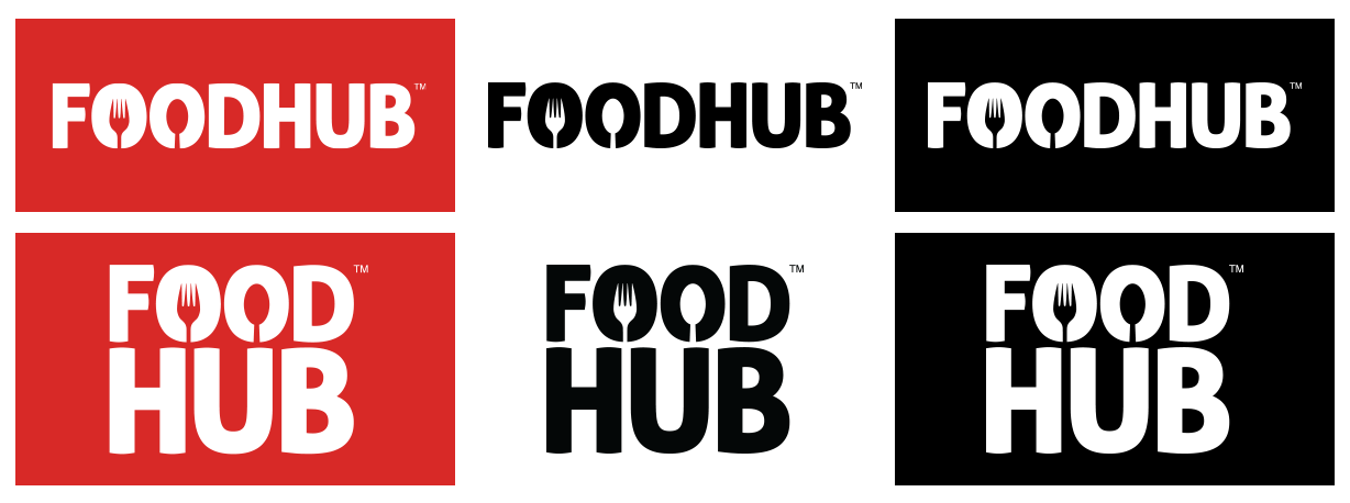
The logo is classic, fresh, clean, and conveys our business. Our primary colour - Red, signifies as assertive, daring, determined, energetic, powerful, enthusiastic, impulsive, exciting, and aggressive. Red represents physical energy, passion, and desire. It symbolizes action, confidence, and courage. The color red is linked to the most primitive physical, emotional, and financial needs of survival and self-preservation.

The clear space has been established for logo visibility and impact. Maintaining the clear space between the logo and other graphic elements such as type, images, other logos, etc. ensures the logo always appears unobstructed and distinctly separate from any other graphic elements.


Use the below QR code while we referring to download Foodhub app using QR scanner.
